Creating the “old” with the new
Latest technology produces historical typeface for artwork
Contact us
A state-of-the-art computer program created a unique piece of wooden artwork at Farringdon underground railway station commemorating the life of Edward Johnston – who is widely regarded as one of the fathers of modern calligraphy.
Johnston, who died in 1944, is credited with introducing the idea of a broad edged pen as a writing tool, and is most famous for designing the sans-serif Johnson typeface that was used throughout the London tube system until it was redesigned in the 1980s. He also redesigned the famous roundel system used throughout the Underground.
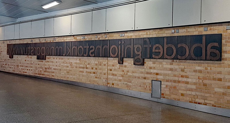
To mark his overall dominant contribution to the London streetscape, a series of letters cut from stained wood are now on display along a walkway wall at Farringdon station. The artwork displays the full alphabet in lower case letters, backwards, with Johnston spelled out in the middle.
The letters were created that way, to reflect how they would have been produced for printing purposes on traditional hot metal printing presses, and to allow a tactile experience, encouraging people to interact with the memorial.
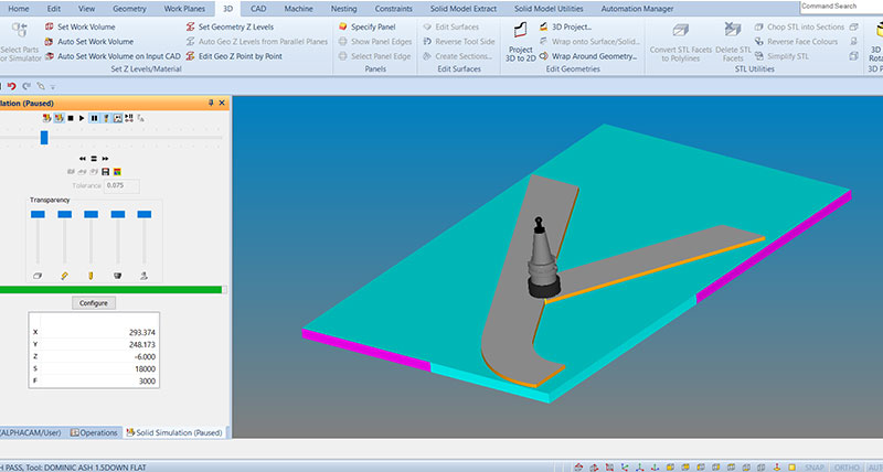
It was designed specifically to look as if it was found in an old store and simply mounted to the wall. But in reality, the letters were cut on a CNC router by an internal architectural joinery company. The complex programs for the toolpaths were created in ALPHACAM, from Hexagon Manufacturing Intelligence, by the software’s Area Sales Manager Andrew Harfield
 In total, there were 27 programs – one for each letter of the alphabet, and one for the capital J, for Johnston. He says the first letter took 30 minutes to program, with three minutes for each of the other letters.
“Programming the first letter for machining from an imported DXF file took the most time. But when that was done, the machining operations were saved as ALPHACAM Machining Styles, and reused for all the other letters. The bulk of the material was removed using a 16mm diameter cutter, with a 4mm cutter to finish the letters, and finally a 1.5mm dimeter tool for the detail in the letter corners.
“This detailed machining was done automatically, as ALPHACAM knows where the excess material is, and only machines in these areas, which saves both programming and machining time.”
The manufacturing process was carried out by an ALPHACAM user on their Biesse CNC machine tool. Andrew Harfield says: “The ALPHACAM programs made it such a simple and foolproof operation for them. All they had to do was load the wood on to the machine tool and run the programs. The programs had already been proven out with ALPHACAM’s simulation functionality, so we knew there wouldn’t be any collisions.
“Special care had to taken when finishing the outside of each block to avoid material breakout known as splintering. But even this was made easy with ALPHACAM’s functionality of being able to partial machine a complete geometry.”
The artwork designer, Fraser Muggeridge, runs a design practice close to Farringdon station. He has done work previously for the Underground, and has also written about the Johnston font.
Artwork image, courtesy of www.ianvisits.co.uk
Johnston, who died in 1944, is credited with introducing the idea of a broad edged pen as a writing tool, and is most famous for designing the sans-serif Johnson typeface that was used throughout the London tube system until it was redesigned in the 1980s. He also redesigned the famous roundel system used throughout the Underground.
To mark his overall dominant contribution to the London streetscape, a series of letters cut from stained wood are now on display along a walkway wall at Farringdon station. The artwork displays the full alphabet in lower case letters, backwards, with Johnston spelled out in the middle.
The letters were created that way, to reflect how they would have been produced for printing purposes on traditional hot metal printing presses, and to allow a tactile experience, encouraging people to interact with the memorial.
It was designed specifically to look as if it was found in an old store and simply mounted to the wall. But in reality, the letters were cut on a CNC router by an internal architectural joinery company. The complex programs for the toolpaths were created in ALPHACAM, from Hexagon Manufacturing Intelligence, by the software’s Area Sales Manager Andrew Harfield
 In total, there were 27 programs – one for each letter of the alphabet, and one for the capital J, for Johnston. He says the first letter took 30 minutes to program, with three minutes for each of the other letters.
“Programming the first letter for machining from an imported DXF file took the most time. But when that was done, the machining operations were saved as ALPHACAM Machining Styles, and reused for all the other letters. The bulk of the material was removed using a 16mm diameter cutter, with a 4mm cutter to finish the letters, and finally a 1.5mm dimeter tool for the detail in the letter corners.
“This detailed machining was done automatically, as ALPHACAM knows where the excess material is, and only machines in these areas, which saves both programming and machining time.”
The manufacturing process was carried out by an ALPHACAM user on their Biesse CNC machine tool. Andrew Harfield says: “The ALPHACAM programs made it such a simple and foolproof operation for them. All they had to do was load the wood on to the machine tool and run the programs. The programs had already been proven out with ALPHACAM’s simulation functionality, so we knew there wouldn’t be any collisions.
“Special care had to taken when finishing the outside of each block to avoid material breakout known as splintering. But even this was made easy with ALPHACAM’s functionality of being able to partial machine a complete geometry.”
The artwork designer, Fraser Muggeridge, runs a design practice close to Farringdon station. He has done work previously for the Underground, and has also written about the Johnston font.
Artwork image, courtesy of www.ianvisits.co.uk
